Pages Tab
This document gives an overview of Form Setup and is focused on the second tab, Pages. The Pages tab is where you create the majority of the layout of the form. You can configure the pages/tasks, segments/fields, buttons, and security to the tasks.
Please note, that some of these configuration options are only available with GT eForms version 3.58.00 (and above) where the form has the “Use Helium Performance” option checked on the General tab.
Navigation: Manage GT eForms 3.x > Form Setup - Pages tab
Features
Page and Condition
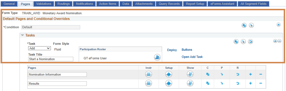
| Field | Value/Use |
|---|---|
| Form Type | Displays the form type ID set during the add process. It cannot be changed. Next to this field, the form type description set on the General tab is displayed. |
| Condition | Each form will have a default condition; additional conditions can be configured using the plus button. The default condition cannot be deleted. |
| Languages (button) | Use this button to access the Multi-Language Support setup |
| Copy (button) (condition-level) | Copy the current condition |
| Paste (button) (condition-level) | Paste the copied condition |
| Revert (button) (condition-level) | Revert the condition to match the default condition |
| Add (button) (condition-level) | Adds a new condition |
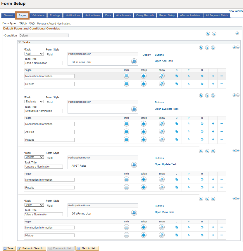
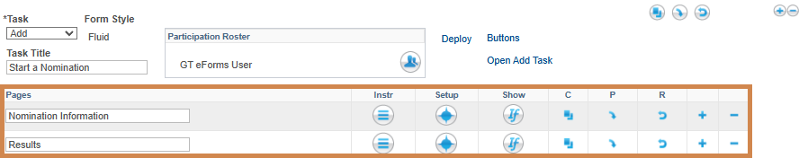
| Task | Choose a Form Task. Forms should have an Add and View task at a minimum. Many forms will have Add, Update, Evaluate, and View tasks. |
| Form Style | Select the form pages to render as Classic or Fluid pages. See PeopleBooks for more information about fluid page styling. |
| Task Title | Enter a title for the task. The usual format is to use the Description that was chosen on the first tab (‘Hire’, ‘Change Employment Status’, etc.) to come up with a task title. Examples: For Add Task – Hire an Employee For Evaluate – Evaluate Hire For Update – Update Hire For View – View Hire Note that this title will appear at the top of each page of the form to clearly show the user what task they are working in. The term "evaluate" is commonly used instead of "approve" since there are options to approve, deny, recycle, or hold. |
| Participation Roster | Defines who can access a task. If blank, security is not restricted. Refer to the Roster Group section on the Roster Engine document for detailed instructions on how to set it up. |
| Deploy Tool (link) | Opens the Deployment Tool in a new tab to generate the content reference for an end-user to navigate to the form. See the Deployment Tool document for more details. Note: this link will only appear next to the Add task. |
| Buttons (link) | Opens the navigation button configuration page (in a modal window) for that specific task. See the Buttons section below for more information. This link will appear only if “Use Helium Performance” is checked on the “General” tab |
| Open Task (link) | Opens the form in the appropriate task. There is a link for every task. The form / search will open regardless if the form is deployed or not. There are three prerequisites to use the links: The Active Flag on the General tab must be checked. The form changes must be saved and built. The Search Configuration must be setup for the task if applicable. |
| Copy (button) (task-level) | Copy the current task |
| Paste (button) (task-level) | Paste the copied task |
| Revert (button) (task-level) | Revert the task to match the default condition |
| Add (button) (task-level) | Adds a new section for another task |
| Delete (button) (task-level) | Deletes the current task section |
| Not Pictured Run Form Build / Build Detail (Link) | Form Build Option set to “Build Immediately on Save” – No link will appear. Form Build Option set to “Save Without Building” – “Run Form Build” link will appear and when selected will open the Form Type Build component in a modal window. Form Build Option set to “Schedule Build on Save” – The link “Build Detail” will appear and when selected will open the Form Type Build component in a modal window. Note: Review the Form Type Build feature document for more information. |
Buttons
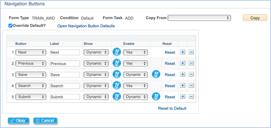
Clicking on the ‘Buttons’ link under a form task will bring up a “Navigation Buttons” configuration, in a modal window, for that task. Here, you can override the default buttons for the task and configure specific buttons and button settings. The override button is not checked by default, and the Form task will use the default buttons as defined in the “Navigation Button Defaults” setup page. See the Navigation Buttons Default document for more information.
Reminder, this “Button” link will only appear for 3.58.00 Helium forms.
| Field | Value/Use |
|---|---|
| Form Type | Displays the name of the current Form Type being changed. |
| Condition | Displays the condition of the current task being changed. |
| Form Task | Displays the current task being changed. |
| Copy From | A dropdown list of other Form Types/Conditions/Tasks where button configuration has been overridden. |
| Copy (button) | Copies the button configuration for the selected option in the “Copy From” dropdown. If not already checked, this button will set the “Override Default?” checkbox to checked |
| Override Default? (checkbox) | Defaulted to unchecked. When unchecked, the 'buttons' grid will be hidden and cleared of any configured values. The form task will use the default buttons and button settings defined in the “Navigation Button Defaults” setup page. When checked, the form shows the button grid and defaults it with values for this task from the “Navigation Button Defaults” setup page but can be changed and the form will display button logic as configured in the grid below. |
| Open Navigation Button Details | This will open a new window/tab that shows the 'Navigation Button Defaults' setup page. See the Navigation Button Defaults feature document for more information. |
Grid Options
| Field | Value/Use |
|---|---|
| Button | Dropdown list of delivered navigation buttons. Options are Approve, Deny, Hold, Next, Previous, Print, Recycle, Resubmit, Save, Search, Submit, and Withdraw. For the buttons that are associated with a form action, please review the Form Statuses and Actions document for more information. |
| Label | Determines the text that will appear on the button visible to the user on the eForm |
| Show | Determines when to show the button to the user on the eForm. Dropdown Options: Yes, No, and Dynamic Yes means always show the button, No means hide the button and Dynamic means use a visual if to determine when to show. |
| Show – Visual If | When 'Dynamic' is selected for the Show column, the Visual If icon will appear. Click the visual if to configure the logic for when the button should be shown. |
| Enable | Determines when the button can be clicked by the user on the eForm. Dropdown Options: Yes, No, and Dynamic Yes means always allow the button to be clicked, No means grey out the button to not allow it to be clicked, and Dynamic means use a visual if to determine when to enable the button. |
| Enable – Visual If | When 'Dynamic' is selected for the Enable column, the Visual If icon will appear. Click the visual if to configure the logic for when the button should be clickable. |
| Reset (link) | This button will only show if the selected button is a default button for this task in the “Navigation Button Defaults” setup page. Clicking this will reset the label, Show, and Enable values for this specific button with the default values defined in the “Navigation Button Defaults” setup page for this task. |
| Add Row (button) | Adds a row to add additional button configuration |
| Delete Row (button) | Removes the current row |
| Reset to Default (link) | Resets the entire grid with the default values defined in the “Navigation Button Defaults” setup page for this task. |
Pages Grid
| Field | Value/Use |
|---|---|
| Page Title | Enter a value that will appear at the top of the page for this task |
| Instr (button) | See the Instr section below |
| Setup (button) | See Setup section below |
| Show (button) | Click to configure Visual If expression to control when a page shows |
| Copy (button) | Copy the current page setup |
| Paste (button) | Paste the copied page setup |
| Revert (button) | Revert the page to match the default condition |
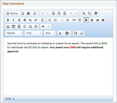
Instr
Clicking on the ‘Instr’ icon on a form task page will bring up a “Step Instructions” modal window, which contains a large rich text box. The text that is entered here will display at the top of the page of the form. This is where any necessary instructions for the users can be entered.
Setup
Clicking on the ‘Setup’ icon on a form task step brings up the Page Details table where page segments are defined.
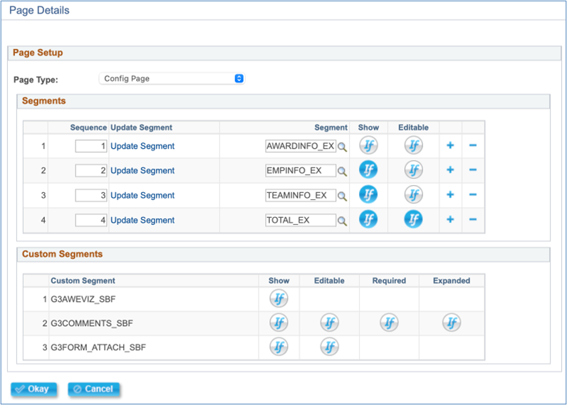
| Field | Value/Use |
|---|---|
| Page Type | Config Page allows you to configure segments that should appear on the page. Custom Page allows the user to insert a custom page in the form. Delivered AdHoc Page is optional and is helpful to configure on the Evaluate task before the Results page to allow a user to add additional steps into the workflow, if Enable Ad Hoc Approvals is checked on the General tab. Delivered Form History Page should be placed as the last page on the View task. Delivered Result Page is required as the last page for the Add, Evaluate, and Update tasks. |
| Sequence | Enter a sequence number. |
| Create/Update Segment (link) | If the Segment field is blank, a 'Create Segment' link will appear. Clicking the link will open a modal window to add a new segment, and then open the Configuration Segment page. If the Segment field is populated, an 'Update Segment' link will appear. Clicking the link will open the Configuration Segment page. See the Configuration Segment section below for more details |
| Segment | Select an existing segment here, if applicable. Leave this blank if creating a new segment |
| Show (button) | Click to configure a visual if to control when a segment appears on the form |
| Editable (button) | Click to create a visual if to control whether users may edit a segment. Note: only visible for select segments in the Evaluate Task. |
| Add (button) | Inserts a row to add/create a new segment |
| Delete (button) | Delete the row for the segment |
| Custom Segment | Delivered custom segment that may have the default behavior modified with visual ifs |
| Show (button) | Click to configure a visual if to control when a segment appears on the form |
| Editable (button) | Click to create a visual if to control whether users may edit a segment. Note: only visible for select segments in the Evaluate Task. |
| Required (button) | Click to configure a visual if to control when a user will be required to enter a comment |
| Expanded (button) | Click to configure a visual if to control when the Comments segment should be expanded |
Custom Page Details
Additional fields appear if Custom Page is selected as the Page Type.
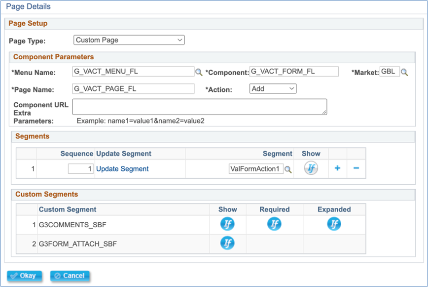
| Field | Value/Use |
|---|---|
| Menu Name | Select menu name |
| Component | Select the component |
| Market | Select the market |
| Page Name | Enter page name |
| Action | Select the action associated with the page |
| Component URL Extra Parameters | Optional location to add technical parameters |
| Segments | Configured segment details that should be included on this page |
| Custom Segments | Delivered custom segment details that may have the default behavior modified with visual ifs |
Custom Segment Options
The custom segment section is found on all page types but the options that appear vary by page and task type. Below is an overview of each custom segment that may appear. See the Visual Ifs for Custom Segments document for more information about when and where each custom segment appears and more information about the visuals if that can be used to modify the default behavior.
| Field | Value/Use |
|---|---|
| G3ACTITMLOG | Action Item Log – Display grid of any action items users had to acknowledge. Logs include the action item checkbox/comment status, the PeopleSoft message catalog set/number displayed to the user, the user ID that acknowledged it, and a date/time stamp. |
| G3AWEVIZ | AWE Visualizer – Displays a button called “View Approval Workflow” that opens a modal window to display the AWE visualizer for a form’s workflow structure. On Delivered Results Pages, this segment also has a message section above the button indicating the action the user took and if workflow has pending approvers, advises the next step in the workflow. |
| G3COMMENTS_SBF | Comments – Displays a long text field for users to type any text into. Once a comment is entered and a form action is taken, the comment is saved and displayed in the Comment History section below the text field with the description of the user that commented, the date and time the comment was made, and the comment itself. This section also displays the log if “Audit Field Changes” is checked on the General tab. |
| G3FORM_ATTACH_SBF | File Attachments – allows a user to upload files. See Form Setup – Attachments document for additional details. |
| G3FORMLOG | Form Log Segment – Displays an audit log of all actions taken on a given form. Logs things such as the date and time, the step in the workflow, the user that took the action, the action taken, and the time elapsed between actions. |
| G3PRINT_SBP | Print Button – will show when there is at least one form report configured on the Report Setup tab to allow a user to “print” a BI Publisher report created to pull in form data. It will be hidden if there are no reports for the form. |
Configuration Segment
The Configuration Segment window is where you add the content of your form. This is accessed by clicking on the “Setup” button on a page, and then either creating or updating a segment.
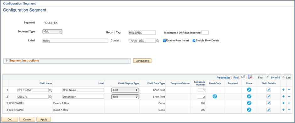
| Field | Value/Use |
|---|---|
| Segment | Displays unique segment identifier created during the add process. |
| Segment Type | Column: individual fields arranged in columns within a segment. Grid: related fields are grouped together in a segment in a grid format. |
| Label | Will be displayed at the top of the segment |
| Record Tag | Defaults to PAGEREC. Used to identify fields belonging to a page. In most cases, it is recommended to use default PAGEREC for all column type segments; however, always use a unique Record Tag for each grid type segment. |
| Context | Indicates the level in GT eForms that this particular segment could be reused. (Defaults to Form Type.) |
| Grid Segment Only – Minimum # Of Rows Inserted | Enter an integer, up to 200, to configure the number of rows that initially appear in the grid when the form first opens. If a user updates the form that triggers the grid to repopulate, this will also be the minimum number of rows that appear in the grid. The user can still add more rows or delete rows, if desired, assuming the Enable row Insert and Enable Row Delete checkboxes are added to the form. Additionally, more rows may appear in the grid beyond the minimum number if the grid is populated via the data pool or a custom load. |
| Grid Segment Only – Enable Row Insert (checkbox) | When checked, adds a field to the grid that allows you to insert additional rows using a “+” button |
| Grid Segment Only – Enable Row Delete (checkbox) | When checked, adds a field to the grid that allows you to delete additional rows using a “-” button |
| Segment Instructions | Expand this section to add instructions that will display for users at the top of the segment. |
| Languages (button) | This button only appears if “Enable Language Config” is checked on the General tab. If clicked, a modal window appears that allows you to translate the Segment Label, Segment Instructions, and Field Labels. |
| Field Name | Lookup fields in PeopleSoft. Optional. If not populated, a field will automatically be created based on the label entered. |
| Label | Display label for field used to derive field name for new fields. Limited to 254 characters, but the real limit is based on how the form looks. Labels that are too long can wrap over other fields, which will mean that your label needs to be shorter. Fluid forms can have longer labels than classic forms. |
| Field Display Type | Select the type of field to be displayed on the form. See below for additional details. |
| Field Data Type | Displays the field type set on the PS field. If it is a newly created field this is open for edits. See below for additional details. |
| Template Column | Denotes whether the field should show on the right or left column on the form. This defaults to ‘Left’ for column segments. |
| Sequence Number | The order in which the fields appear. Generally, this is automatically set in design mode for the form. |
| Read Only | Indicator to show display-only fields. Blue Check: display-only. Blank: not display-only (editable.) Blue 'If' Icon: display-only based on Visual If expression (dynamic.) |
| Required | Indicator to show required fields. Blue Check: required field. Blank: not required field. Blue If Icon: required based on Visual If expression (dynamic). |
| Show | Indicator for fields that show on the eForm. Blue Check: field shown. Blank: field hidden. Blue If Icon: field shown based on Visual If expression (dynamic). |
| Field Details | See the Segment Field Configuration section below |
Field Display Types
| Option | Image | Description |
|---|---|---|
| Button |  | Displays label as a button on the form. Additional custom development is required to enable button functionality on eForm |
| Checkbox | Checkbox in Classic  Checkbox in Fluid  | Displays either a checkbox or a yes/no slider for the field. A value of Y = Yes A value of N = No |
| Currency |  | Works with the new Currency Form configuration on the Form Setup table to display currency codes on forms |
| Date |  | Inserts a date picker next to the eForm field |
| Dropdown |  | Allows the selection of a discrete set of values. Users will need to set Dropdown Source in Field Details. See the section below for more details. |
| Edit |  | Allows text entry |
| Instructions |  | Allows text to be added anywhere on a form instead of just at page and segment headers. Users will need to define text for instructions in Field Details. See the section below for more details. |
| Link |  | Displays label as a hyperlink on the form. Additional custom development is required to enable link functionality on eForm |
| Rich Text |  | Allows for the use of fonts, images, hyperlinks, and other rich text options in building descriptive or interactive text NOTE: Only works in Fluid |
| Prompt |  | Inserts a looking glass next to the eForm field. Users will need to define Prompt Settings in Field Details. See the section below for more details. |
| Time |  | Displays field value as HH:MM AM/PM. |
Field Data Types
- A delivered PeopleSoft field will default the data type to the existing database field type and cannot be changed by a functional form builder. Once a custom field is saved, a functional form builder will no longer be able to change the field data type in Form Setup.
- All field types have valid field display type combinations. NOTE: All field display types may be available before segment configuration is displayed. Verify valid combinations before testing an eForm.
| Type | Description | Valid Display Types |
|---|---|---|
| 2 Decimal | Allows numbers with 2 decimal places, maximum of 33 characters (30 characters before decimal and 2 characters after decimal) | Currency, Edit |
| Code | Allows amaximum of 4 characters, an abbreviated field value | Button, Checkbox, Dropdown, Edit, Link, Prompt |
| Date | Defaults to system preference date format | Date |
| Integer (0 decimals) | Allows number with no decimal places, maximum of 31 characters | Currency, Dropdown, Edit, Prompt |
| Large Number (6 decimals) | Allows number with 6 decimal places, maximum of 33 characters (26 characters before decimal and 6 characters after decimal) | Currency, Edit |
| Long Text | Allows 100+ characters | Edit, Instructions, Rich Text |
| Medium Text | Allows a maximum of 100 characters | Dropdown, Edit, Prompt |
| Short Text | Allows a maximum of 30 characters | Dropdown, Edit, Prompt |
| Time | Allows HH:MM AM/PM format. Time can also be entered as military time | Time |
Changes to field data types render prior forms inaccessible
When a form builder creates a field, the field is designated a data type which determines how PeopleSoft stores the data for that field. Once the field is designated a data type, functional users can’t change that data type. However, sometimes form builders find the need to use a different data type after creating a field. If a form requires a change of field data type, the type of environment you’re using will help you decide what to do. If you’re in a DEV environment and you don’t need to access previous form transactions, a developer can change the data type of the field via App Designer.
In a Production environment, we do not recommend changing an existing field’s data type because it is likely to produce an error message when users try to open forms that were submitted before the change, rendering them inaccessible. In cases where previous form transactions need to be accessible and a field data type change is necessary, we recommend hiding the original field and creating a new field with the required data type, thus preserving the data connected to the original field. This is the easiest method for a Production environment as it doesn’t require any data conversion.
If you delete an old field and need to move the data in the old field from old forms into a new field, this will require the development of a data conversion process. Please contact Tech Support (support@gideontaylor.com) for assistance with this type of task.
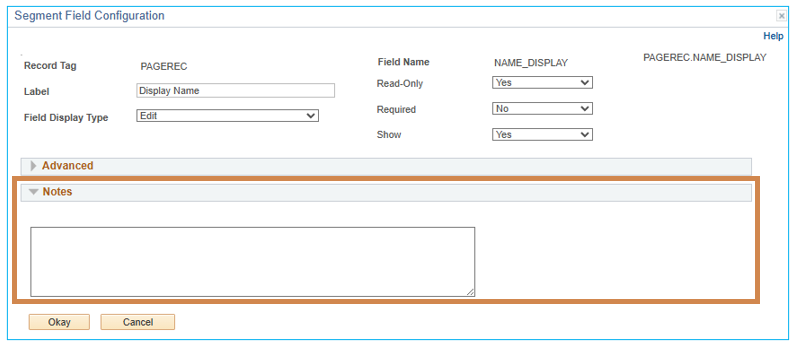
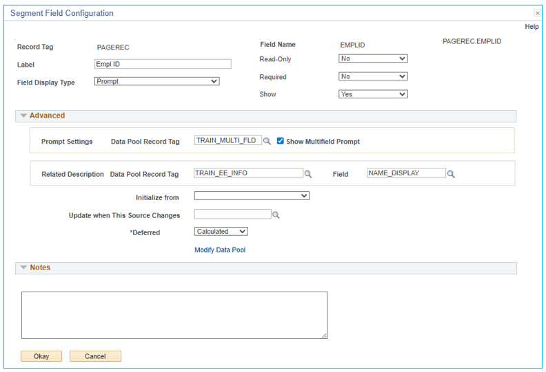
Segment Field Configuration
Clicking the “Field Details” icon will open the Segment Fields Configuration page. Certain Field Display Type Values will generate additional configuration fields.

| Field | Value/Use |
|---|---|
| Record Tag | A display-only record tag of the segment containing this field |
| Label | Field Label carried over from the previous page. The label is displayed next to the field on the form. |
| Field Display Type | Shows display type and allows for changes without closing the Field Details window |
| Field Name | Display-only name of the selected field |
| Read Only | Determines whether a field is display-only. Yes: display only. No: editable field. Dynamic: when selected, a Visual If icon will appear, configure a Visual If expression to control when a field is display-only. |
| Required | Determines whether a field is required. Yes: required. No: not required (eForm users may leave blank). Dynamic: when selected, a Visual If icon will appear, configure a Visual If expression to control when a field is required. |
| Show | Determines whether a field is shown on an eForm. Yes: show field. No: hide field. Dynamic: when selected, a Visual If icon will appear, configure a Visual If expression to control when a field is shown. |
| Span Columns (checkbox, Not Pictured) | If checked, will expand the field across both the left and right columns in the segment. *Available only when field display type is set to Long Text. |
Instructions Settings
If a Field Display Type is set to Instructions, an Instructions section appears in Field Details.
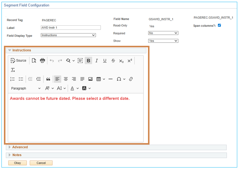
| Field | Value/Use |
|---|---|
| Instructions (collapsible section) | Expand this section to show a large rich text editor where the text for the instructions will display for users based on the column and sequence number specified for the field. |
| Span columns? (checkbox) | If checked, will expand the field across both the left and right column in the segment. Note: this checkbox also appears any time a field has the Field Data Type set to Long Text |
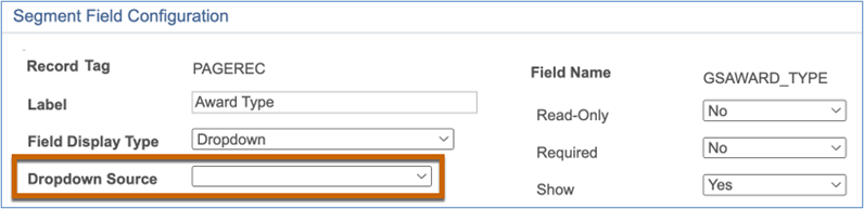
Dropdown Settings
If a Field Display Type is set to Dropdown, a Dropdown Source field appears:
Dropdown Source Options:
- App Package- The dropdown values are generated by a
SetSortDropDownListhook in an application package. See the API documentation for more information. - Prompt Display- The dropdown values come from a data pool record, as configured in the Prompt Settings section. See the Prompt Settings section below for additional details. Code can still be used to add items, remove items, or sort items.
- Translate Long - The dropdown values come from the long descriptions in the translate values. Code can still be used to add items, remove items, or sort items. For 3.58.00 Helium Performance eForms, the order of the values can be customized without code. See the Dropdown Values section below for more information.
- Translate Short- The dropdown values come from the short descriptions in the translate values. Code can still be used to add items, remove items, or sort items. For 3.58.00 Helium Performance eForms, the order of the values can be customized without code. See the Dropdown Values section below for more information.
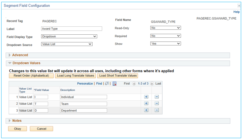
- Value List – For 3.58.00 Helium Performance eForms only! This option allows the user to create a list of values and labels for use within eForms. It is not tied to the delivered PeopleSoft field’s translate values table. See the Dropdown Values section below for more information.
Dropdown Values Section
If a Dropdown Source is equal to 'Translate Long', 'Translate Short', or 'Value List', then the Dropdown Values section will appear.
| Field | Value/Use | Visibility Based on Dropdown Source Value |
|---|---|---|
| Use Custom Order (checkbox) (not pictured) | Check the box if you want to customize the order. | Translate Long Translate Short |
| Reset Order (Alphabetical) (button) | Click the button to arrange the options alphabetically based on the Long Name / Short Name / Description. | Translate Long Translate Short Value List |
| Load Long Translate Values (button) | Loads the Values and Long Names from the Translate Value into the grid. | Value List (As long as the field has long translate values configured) |
| Load Short Translate Values (button) | Loads the Values and Short Names from the Translate Value into the grid. | Value List (As long as the field has short translate values configured) |
Grid Options
| Field | Value/Use | Visibility Based on Dropdown Source Value |
|---|---|---|
| Not Pictured Up Arrow (button) | Moves the grid row up. Used to manually sort the fields in the order a user wants them to appear in the eForm dropdown. | Translate Long Translate Short |
| Down Arrow (button) (not pictured) | Moves the grid row down. Used to manually sort the fields in the order a user wants them to appear in the eForm dropdown. | Translate Long Translate Short |
| Value List Type | This field tells you the type of list from the Dropdown Source. Options are Value List, Long, and Short. | Translate Long Translate Short Value List |
| Field Value | This is the code value (up to four characters) for the field that is stored in the form data. | Translate Long, Translate Short, Value List |
| Long Name (not pictured) | Long Name in the Translate Value that appears in the eForm dropdown. | Translate Long |
| Short Name (not pictured) | Short Name in the Translate Value that appears in the eForm dropdown. | Translate Short |
| Description | Description of the Field Value that appears in the eForm dropdown. | Value List |
| Add (button) | Adds a row to the grid. | Value List |
| Delete (button) | Deletes a row from the grid. Existing eForms where the deleted value was used will no longer display when viewing the eForm. The Field Value will still be in the Form Data for the eForm. | Value List |
Below are things to consider when choosing between the Translate Value and Value List options for a Dropdown Source.
- Value list items and configuration migrate with the GT Form Transporter, but PeopleSoft’s Translate Values do not.
- PeopleSoft Translate Values have an effective date option to deactivate a value instead of deleting the value. GT’s Value Lists do not have an effective date option.
- The dropdown features are set at the field level regardless of segment or form type. Changing the order of the values or changing the values themselves will apply these changes wherever the field is used in eForms. If you need the same list of values to appear in a different order from one form type to another, you must use a different field on each form type.
1. To create/edit custom Value Lists at the GT Framework level, you can access all value lists here:
2. Navigation: Manage GT eForms 3.x > GT Functional Setup > eForm Parts Gallery > Value Lists
Prompt Settings
These fields are available only when the Field Display Type is set to Prompt or when the Field Display Type is 'Dropdown' and the Dropdown Source is Prompt.
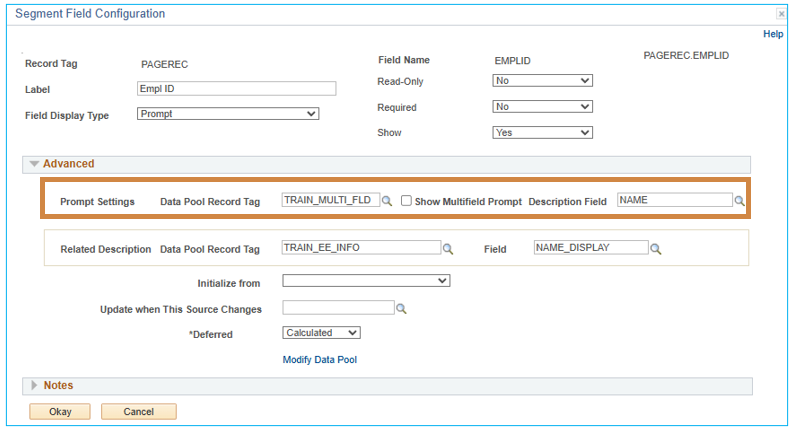
| Field | Value/Use |
|---|---|
| Data Pool Record Tag | Lookup shows all Pool Tags configured in this form type’s Data Pool. The Record Tag selected here will determine the values available in an eForm field prompt window. |
| Show Multifield Prompt | Defaults to checked. When checked, displays all fields from the data pool record defined as search criteria and search results fields at the record level. |
| Description Field | Appears if Show Multifield Prompt is unchecked. Lookup shows all fields available on the associated Data Pool Record Tag. The field selected here will display as a description next to the available prompt values in an eForm field prompt window. |
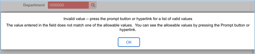
Invalid Values Display
When a prompt setting is configured, only valid values will be allowed on the form. Values that do not exist in the list of valid values based on the configured data pool will be shown in russet red to alert the user that the field value is invalid.
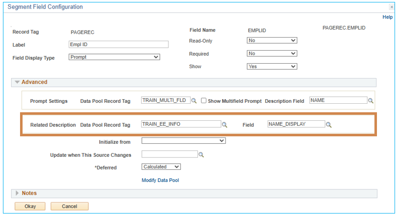
'Related Description' Settings
These settings here will make a read-only value appear to the right of the field. This value is for informational purposes only. Related Description values are NOT stored with the form data.
| Field | Value/Use |
|---|---|
| Data Pool Record Tag | Lookup shows all Pool Tags configured in this form type’s Data Pool. The Record Tag selected here will determine the values available in an eForm field prompt window. |
| Field | Lookup shows all fields available on the associated Data Pool Record Tag. The field selected here will display as a description next to the eForm field. |
Data Pool Field Population Settings
| Field | Value/Use |
|---|---|
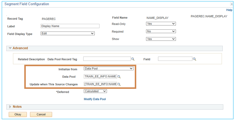
| Initialize from | Dropdown to select how the framework should generate the value to appear in the field when the form initially loads. Dropdown Options = Constant, Data Pool, or Smart Source |
| Constant (not pictured) | Appears if “Initialize from” is set to Constant Enter a static value to populate this field on form load. Constant values should obey field types (dates for date fields, code values for code fields) |
| Data Pool | Appears if “Initialize from” is set to Data Pool Enter a data pool smart source that will return a value based on the keys set on the data pool. The returned value will populate this field on form load |
| Smart Source (not pictured) | Appears if “Initialize from” is set to Smart Source Enter a dynamic smart source value to populate this field on form load. Note: if your smart source is a data pool smart source, this option should not be used, and “Initialize from” should be set to Data Pool instead. |
| Update when This Source Changes | Enter any smart source to populate this field. This logic will only run once the form is open and once any fields the smart source is dependent on change. |
| 3.50 Standard Forms: Disable Page Refresh when Field Changes | When checked, the form will not be repainted/refreshed when this field is changed but will refresh when another action on the form triggers the update. |
| 3.50 Helium Forms: Deferred | Dropdown contains 3 options: Calculated (default value) - The framework will determine if the field has dependencies to determine if a field should be deferred. Off – Forces a field to NOT defer processing even if the framework determines it can be. One reason to do this is to force a trip on fields that benefit from validating formatting after the user leaves the field, such as date and number fields. On – Forces a field to be deferred even if the framework determines something depends on it on it. The dependencies will get resolved for deferred fields during the next trip that is triggered. |
| Modify Data Pool (link) | Shortcut to access to open the data pool in a modal window |
Notes
As of the 3.75.00 release, Notes can now be entered to document information about the field for future reference. Notes are not displayed to form users.